If you’re a business owner putting together materials to submit to a private equity firm, web design might be the last thing you’re thinking about. But what if we told you that the same design principles that govern website development can actually help your capital raising pursuits?
Think about it this way: when someone develops a website to engage potential customers, that website’s ability to drive conversion has a direct impact on the company’s bottom line. Likewise, when you submit a business plan to persuade potential investors, your business plan’s ability to advise on an investment has a direct impact on your fundraising success.
If your product is developed for the purpose of inspiring a specific action – whether a purchase or an investment, your strategy should be focused on creating user experiences that motivate that action.
UX (User Experience) design, while traditionally spoken in the same breath as web development, is an incredibly powerful tool to incorporate in your investor communication documents. Coined in the early 90’s by Don Norman, UX design is the process of supporting user behaviour by designing products that provide meaningful experiences to end-users. The thought processes behind many familiar web features such as button hover animations or navigation structures are born from UX design principles. But as user experience is not relegated to just web or app interactions, it’s important to understand how UX plays a role in other areas of business.
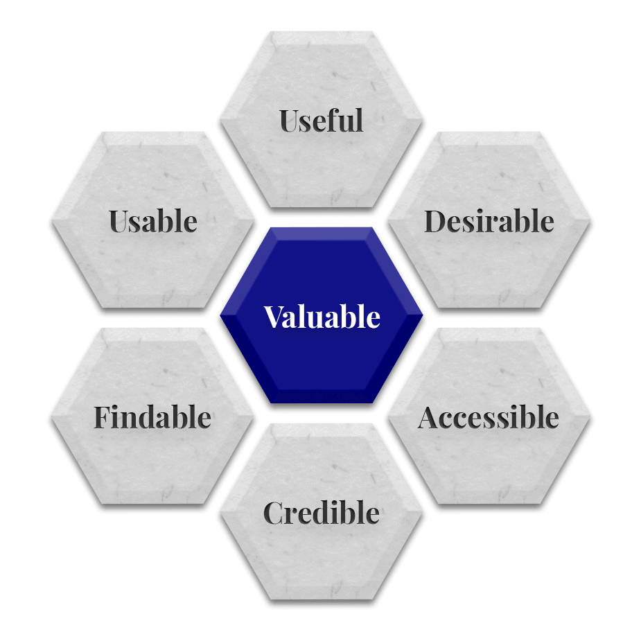
Using Peter Morville’s ‘User Experience Honeycomb,’ we summarize 7 basic UX principles in the traditional context of web design, and illustrate how they can be adapted to the investor communication materials you will be required to submit throughout the capital raising process.
User Experience Honeycomb
1. Useful – Fulfilling a Need
Traditional Meaning
Creating a functional interface that allows users to perform and complete a task (e.g. purchasing a product on an e-commerce website.)
Investor Communication Meaning
Presenting a document that clearly addresses the questions an investor may have (e.g. what are your financial projections?)
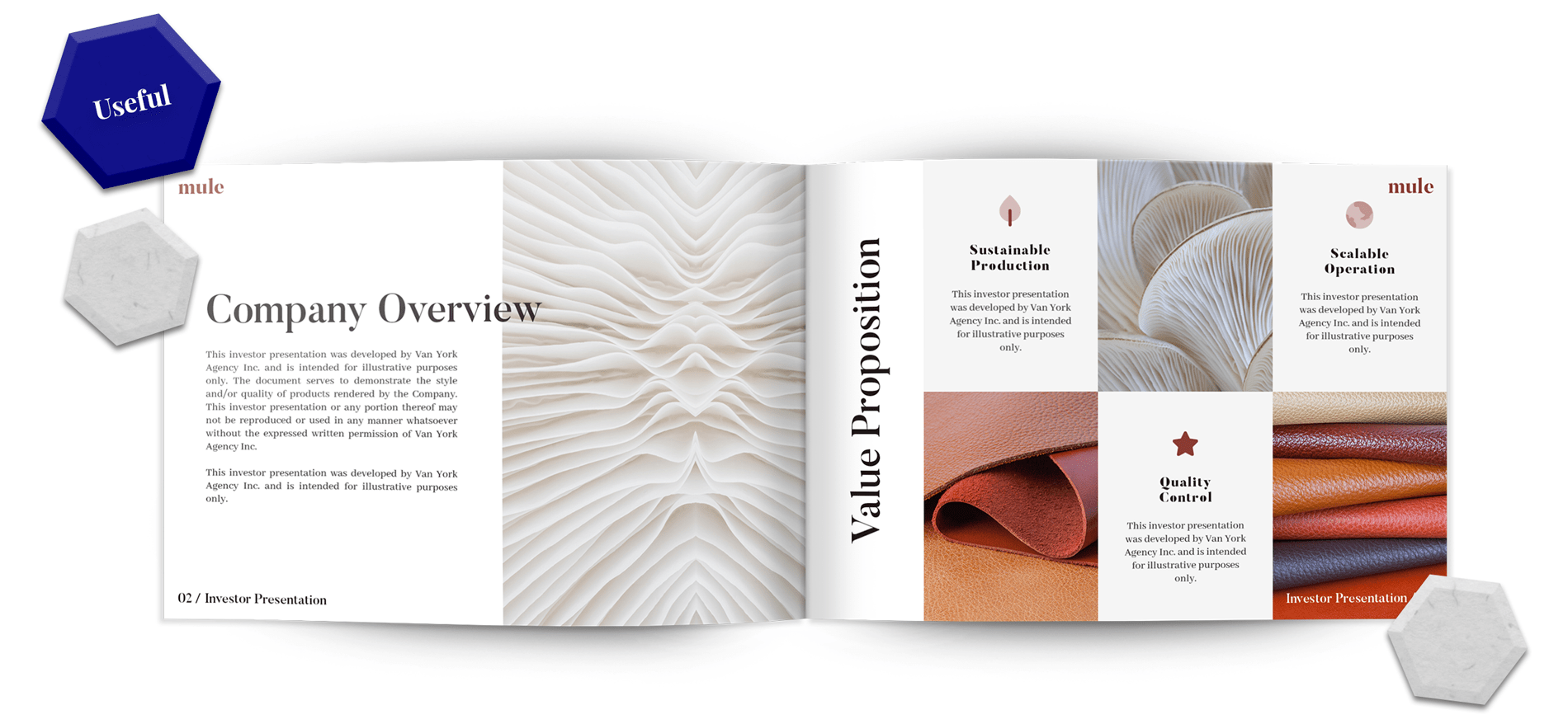
At the bare minimum, whatever you design or develop should serve its designated purpose. For business plans and investor pitch decks, this means to inform, advise and convince the end-user that your proposed venture or offering is valuable. This is achieved by explicitly answering three basic questions: What do you do? How do you do it? What value will it bring? These answers should be stated early in your document or presentation, with subsequent chapters and/or slides reinforcing and supporting that information.
Van York Tip
When stating and later referencing your value proposition, use the same language and visual content (e.g. iconography) throughout the document to cement your position with the reader. Repetition is a powerful tool that can help your audience recall important details about your proposal.
2. Usable – Ease of Use
Traditional Meaning
Designing a website or an app that is straight-forward and easy to use.
Investor Communication Meaning
Creating a document that is easy to read and comprehend.
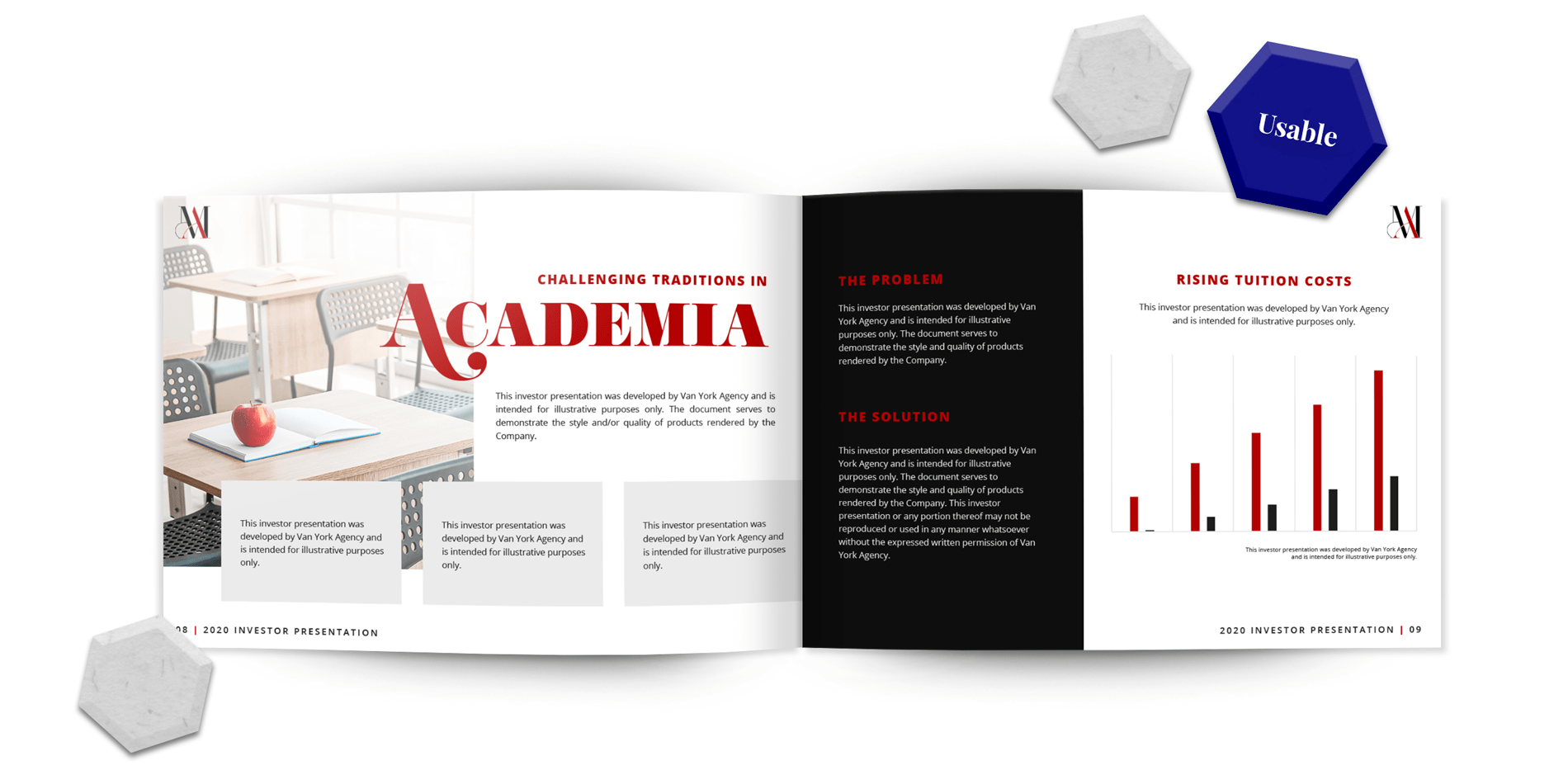
You can have the most innovative and lucrative deal of the century – but how you organize and present that information on paper could make or break your fundraising endeavors. It seems as though it would be simple to just transfer your idea to paper, but it’s just as easy to forget about the reader when you’re filling pages with the 549 reasons why you believe you have a solid investment opportunity.
A good way to ensure you’re drafting a digestible document is to be aware of the length of your content and number of pages. For example, in most cases, the Executive Summary in your business plan should not exceed 5 pages. Keeping this mind will help you better organize and prioritize the information you want to relay. It’s also a good idea to appropriately label the headers and footers of your business plan. A reminder of where one is in your document can help the reader easily consume it in more than one sitting.
Van York Tip
Before developing your pitch deck, determine the intended use of the document. If your deck will be used as a presentation aid, keep it at 10-20 slides, with each slide consisting of 100 words or less.
If you’re operating in the tech space, you might be looking to treat your pitch deck as your business plan. In this case, you may wish to add more slides to your document, but your word count per slide should still remain within the threshold of 100 words – 150 at most.
3. Desirable – Inciting an Emotion
Traditional Meaning
Developing a beautiful and memorable interface that excites a user and motivates them to return.
Investor Communication Meaning
Producing a beautiful and memorable document that compels a reader to further consider your proposal.
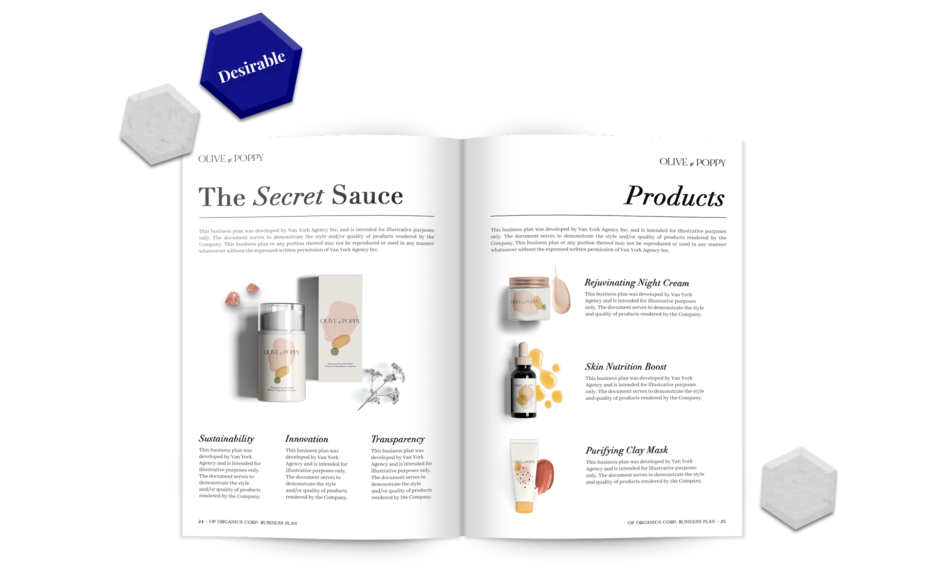
Desirability refers to the important features that we typically associate with design: brand, identity, visuals, imagery and so on – the elements of which elicit emotional responses in users. Don Norman ascribes three distinct levels of emotional design: visceral, behavioural and reflective:
Visceral: Quick reactions and judgements of stimuli; an initial response to the proposed experience // Does your document leave a good first impression? Do the first few pages compel a reader to turn the page? Did the Executive Summary entice them to read the rest of the document?
Behavioural: Subconsciously influenced by the Visceral level; the progression of the user’s experience // Is the content in your business plan or pitch deck interesting as much as it is informative? Are you using appropriate language? Are you financials easy enough to comprehend?
Reflective: Intellectual level of thinking; judgement following the user’s experience // Did your business plan convince the reader of the value behind the investment? Did it prompt them to take the next steps or perhaps share your document with a colleague?
Van York Tip
Use visual content to your advantage when communicating your value. If you’re in the business of selling branded products, include high-quality images of those products throughout the document (where appropriate.) If your value offering includes a complex technology, use infographics to showcase how that technology works. Studies have shown that visuals are 43% more persuasive than text, which becomes incredibly useful when structuring a document for the purpose of raising capital.
4. Findable – Logical Navigation
Traditional Meaning
Organizing a logical page structure and easy navigation through the use of information architecture.
Investor Communication Meaning
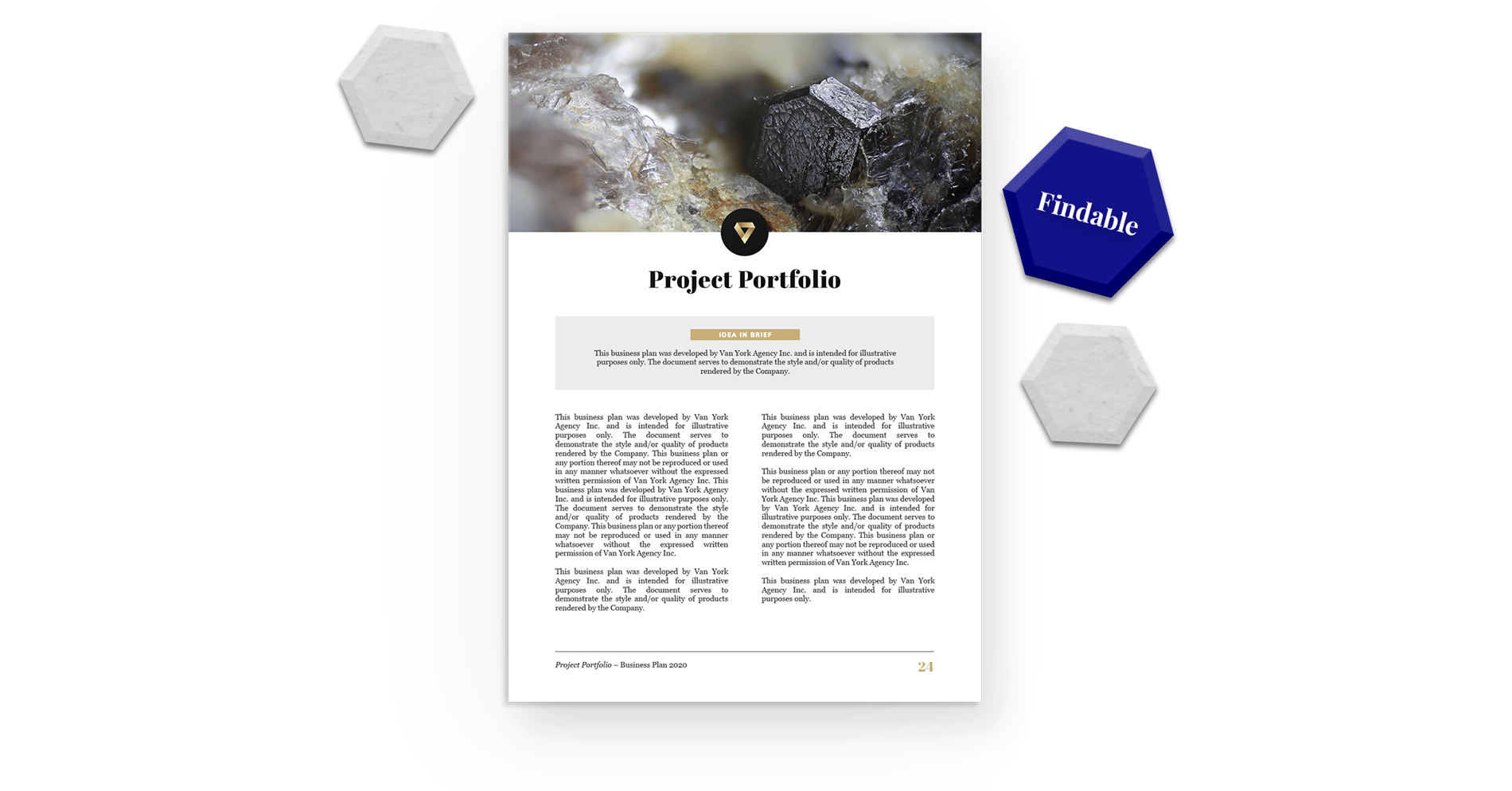
Structuring a document in a logical manner to ensure a natural flow of information.
If you were to consider how a website’s navigation menu could translate to a business plan, the obvious answer would be the Table of Contents (TOC.) Most modern PDF viewers enable click-through links in a TOC to help users navigate a document. But for digital and physical documents alike, the most important element of a TOC is a logical structure.
Most people know to introduce a business plan with an Executive Summary, but the order of subsequent chapters can be flexible and differs from company to company. For example, if a primary feature of your value proposition is the expertise of your executive team, it would make sense to introduce a “Management” chapter early in the document. The same applies if your predominant value stems from your business model, your breadth of products, your proprietary technology, and so on.
It’s equally important to pay attention to how you conclude each chapter, as well as the document itself. Does the end of each chapter help the reader understand the implications of the content consumed up to that point? Does the information at the end of your business plan reinforce that which was introduced in the beginning? Are you introducing any new details in the end that may be better served earlier in the document?
Van York Tip
When introducing a new chapter, start with a brief overview of what the reader can expect to read. This helps manage a reader’s expectations and gives them the power to decide how to navigate your document.
5. Accessible – Catering to Different Users
Traditional Meaning
Designing websites and interfaces that are accessible to all users, including those with disabilities.
Investor Communication Meaning
Appropriately relaying information by translating technical jargon to a language investors can understand.
Designing accessible websites and interfaces involves a careful examination of text sizing, colour contrasts and other elements that enable a diverse audience to navigate a web page. This criteria is not limited to digital platforms – selecting appropriate font sizes and colour palettes is crucial in designing an effective business plan or pitch deck. However, accessibility can also include language.
If you’re operating in a field with a range of industry-specific jargon, it’s important to consider that not every investor you approach will have the same base knowledge of your industry as you do. Assuming your reader will understand technical terms is dangerous, especially if those terms comprise a primary component of your value proposition.
For example, say you and your team spent two decades developing a proprietary technology that, with a substantial capital injection, could revolutionize the industry. Your R&D department put together a promising Proof of Concept that is well-documented in the form of technical outcomes and scientific data. By simply copying and pasting that information into your business plan, you risk losing your audience because the investor is likely not an engineer themselves. It’s important for you to effectively relay just how promising your technology could be in terms that your reader can understand.
Van York Tip
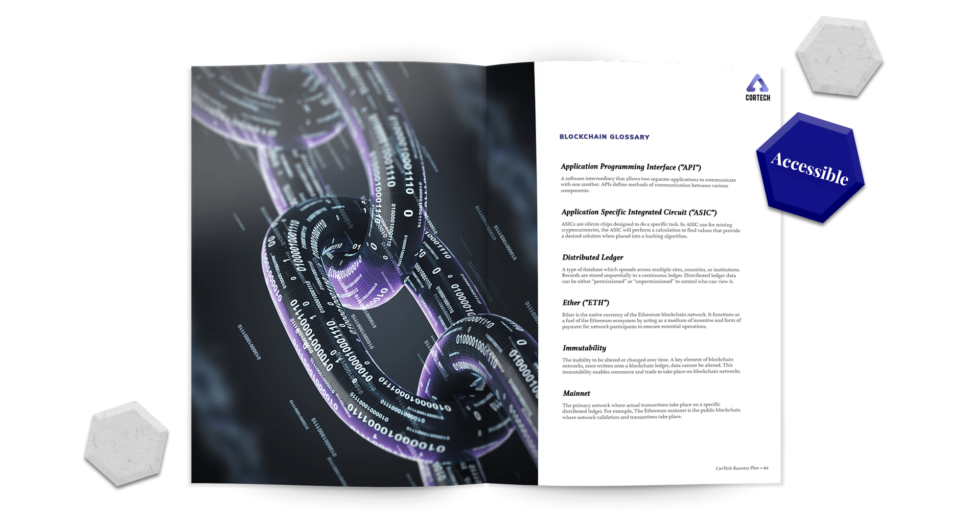
If you’re in an industry with specific or technical terminology that is relevant to your value offering or business, consider adding a glossary in the beginning of your document, with the formal definition of each term and how that term applies to your specific purpose.
6. Credible – Building Trust
Traditional Meaning
Creating user experiences that foster trust in your company.
Investor Communication Meaning
Including sufficient information that instills trust in your company and executive management.
When it comes to investor communication, transparency is vital. Earning the trust of a user becomes much more important when you’re persuading that user to make a capital investment. In most cases, your business plan and/or investor pitch deck will act as an aid to the investor’s due diligence process. As such, it is important to ensure your data is derived from reputable sources, that your financials are presented alongside all relevant assumptions and that any opinions or predictions are labelled as such. When reviewing your business plan or pitch deck and assessing its credibility, ask yourself:
Market Data: Where did these figures come from? Did they come from a reputable source that I can find online? Was this published within the last two years?
Financial Projections: Did I clearly present the assumptions that my Income Statement is based on? Are the market growth rates reflected in my market analysis? Am I using the appropriate financial models to convey my company’s financial position?
Executive Management: Is there a chapter or section in my business plan that showcases the members of the executive team and their respective roles? Are these members accurately represented in the document? Did I include the contact information for the principal point of contact?
Van York Tip
A good way to showcase your company’s credibility is to include a comprehensive overview of your management team, including each member’s professional achievements and accolades. Be sure to also include any details you feel are relevant to your business venture. Sometimes the value a team member brings to the table stretches outside the confines of his resume. Expand on those details and communicate that value to an investor. In some cases, investors look to invest in people more so than the business model.

7. Valuable – Motivating an Action
Traditional Meaning
Designing user experiences that either advance the company mission or contribute directly to the bottom line.
Investor Communication Meaning
Designing user experiences that directly impact the company’s fundraising initiatives.
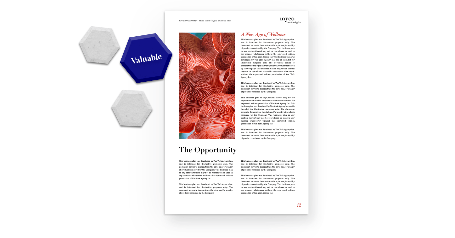
The culmination of the 6 aforementioned principles lead directly to the final, and most important, consideration: value. This is especially true for investor communication, where the value proposition is the primary driver of your marketing documents. Every business plan and pitch deck has a specific and unique narrative regarding your value, and every section and chapter of your document should reflect that. If you review your document and find that the information you included does not support, reinforce or provide context for that narrative, it can likely be excluded from the final presentation.
Van York Tip
When writing your business plan, conclude each chapter with a call-back to your value proposition and how it aligns with the information you just shared. For example, if your Market Analysis chapter features promising growth rates, market trends and shifting consumer preferences, conclude the chapter by explaining how that information fits in with your company’s business model and ongoing strategy.
In Summary:
Communicating with your audiences – whether they’re a loyal customer or potential investor – requires the ability to speak in their language. And with the ubiquity of digital communication, that language is largely visual.
User experience design helps eliminate barriers in understanding and digesting important information – which is tremendously advantageous when communicating value to investors. Designing for exceptional user experiences shouldn’t be confined to websites and apps. It should be implemented in any important engagement that supports the growth of your business – including online and offline interactions.
Note: All graphics and data visualization featured in this post were created by Van York Agency Inc.

Katya Polo is a business development professional with both an MBA and over a decade of digital design experience. Specializing in both strategic planning and brand development, Katya has produced 75+ business plans and pitch decks that have helped raise over $1.3 billion in investment capital.
How can we help you?
Get in touch with us to speak with a consultant and start working with a multi-functional marketing agency.


